A dashboard should support a decision
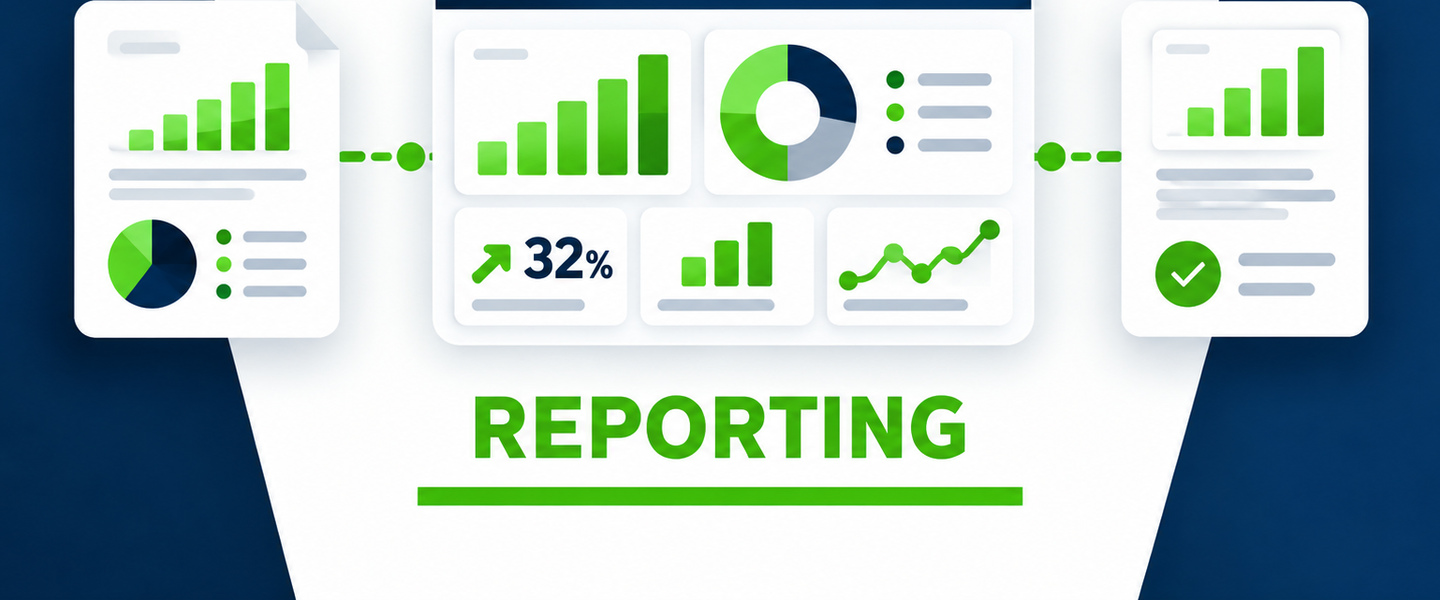
The first question is not which chart looks best. It is what the reader needs to know or decide. A dashboard earns its space when it helps management recognize a change, understand an exception, or decide where attention is needed.
Use a focused set of KPIs
Do not put every available metric on the first screen. Select the measures that represent performance, capacity, quality, timing, risk, or progress toward a goal. Detailed supporting data can sit behind the summary when someone needs to investigate further.
Show context, not isolated numbers
A number by itself is hard to interpret. Whenever practical, show the comparison that gives it meaning: target, prior period, trend, expected range, budget, service level, or another relevant benchmark.
Make exceptions easy to find
Management should not have to scan hundreds of rows to discover what needs attention. Highlight overdue work, unusual variance, missing data, capacity issues, quality problems, or other conditions that require follow-up.
Show data freshness and definitions
Users need to know when the data was last updated and what each metric means. If two departments use different definitions for the same KPI, the dashboard will create debate instead of clarity.
Keep operational detail available, but do not make leadership reconstruct the story from raw rows every time they open the report.
Connect the dashboard to action
When a metric is off target, the next question is who owns the response. Depending on the workflow, the dashboard may link to the underlying items, show an assigned owner, or connect to an action tracker.
Match the view to the audience
A front-line manager may need detail by employee, job, customer, or location. An executive may need trends, totals, risk, and a small number of exceptions. One giant dashboard rarely serves every audience equally well.
Keep the preparation process sustainable
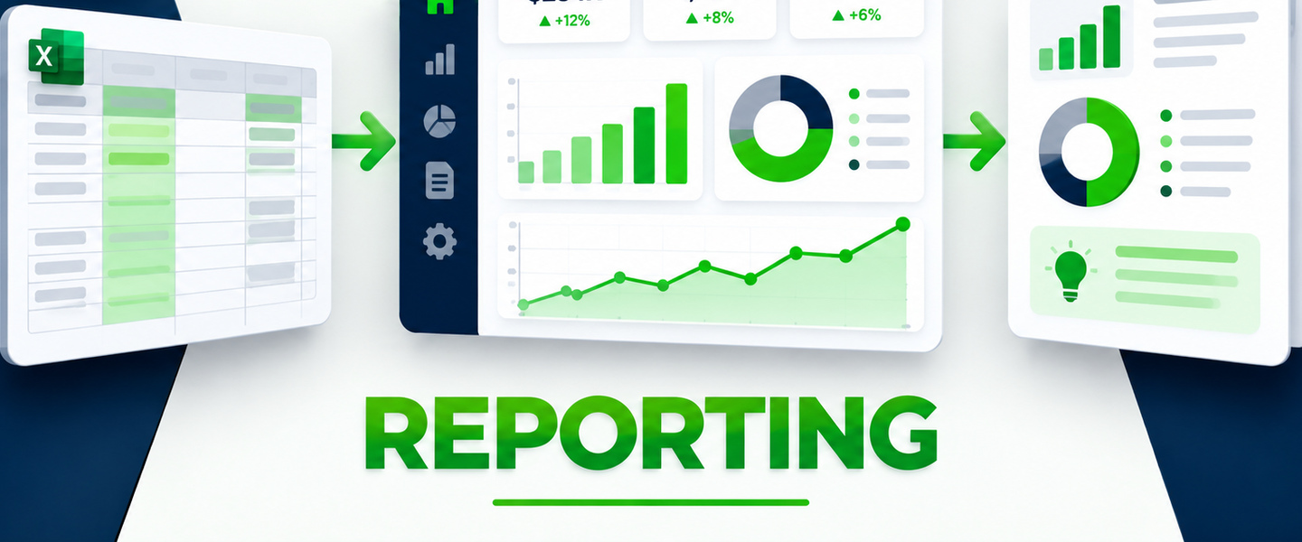
If the dashboard takes hours of manual copying and cleanup every week, the reporting process is part of the problem. Standardize the data definitions and automate repeatable preparation steps where possible.