Start with the decision, not the chart
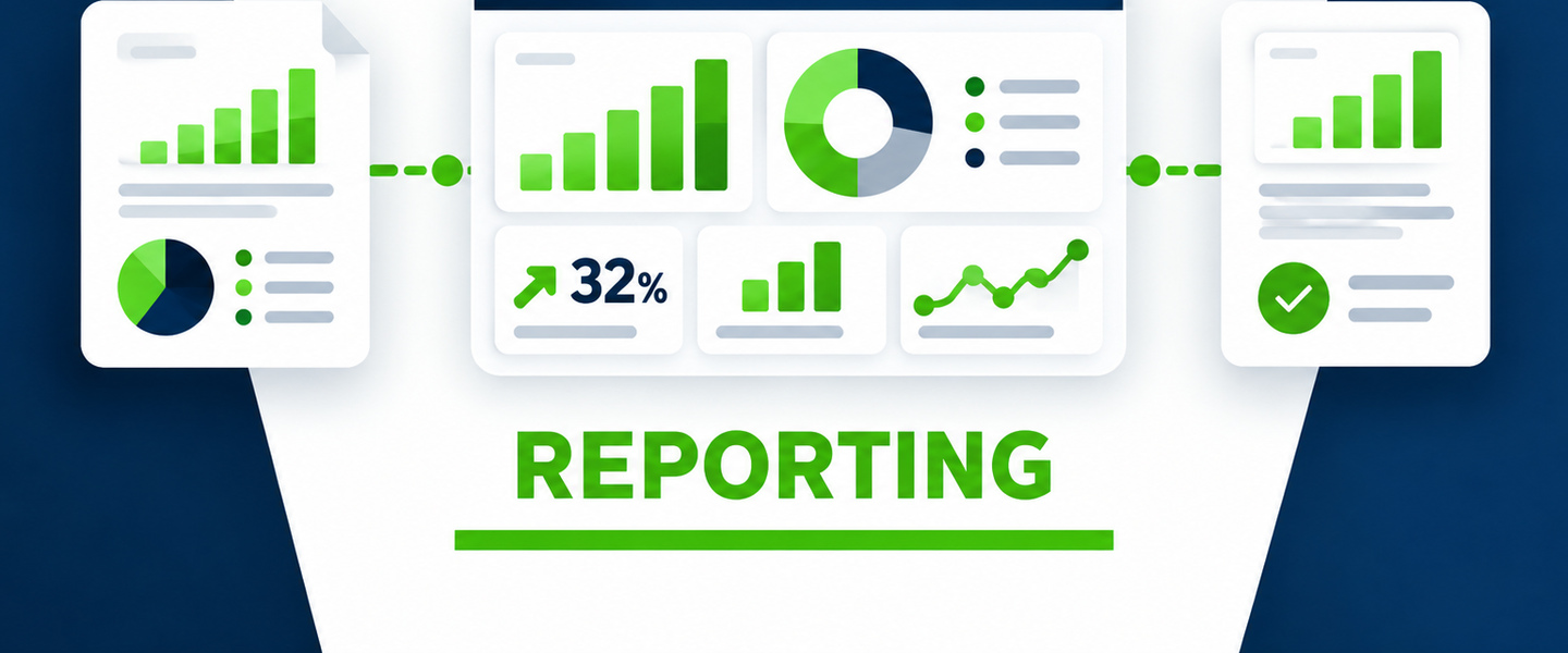
Before building a dashboard, ask what the reader needs to know or decide. A beautiful chart that does not change a decision is decoration. Useful reporting starts with questions: What changed? Why? Where are we falling behind? What needs intervention?
Create one source of truth where possible
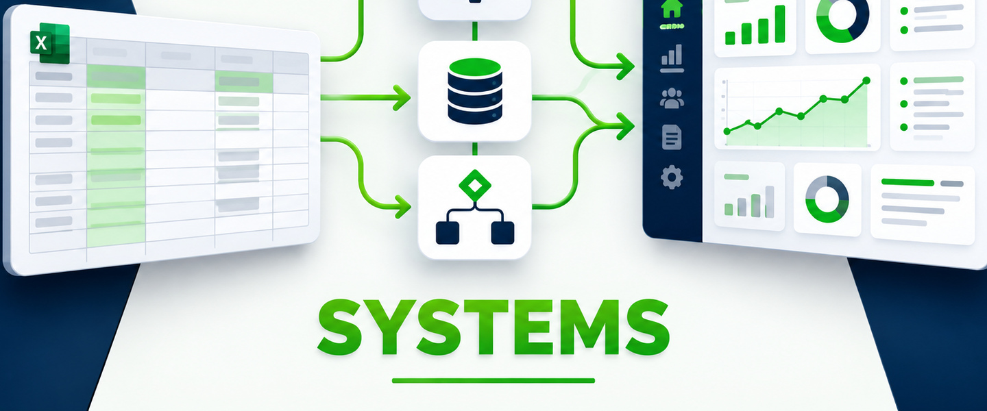
Multiple versions of the same spreadsheet create confusion quickly. Establish clear ownership, data definitions, update timing, and a reliable source for each metric. If the data is inconsistent, the reporting will be inconsistent.
Separate operational detail from executive reporting
The person managing the work may need individual tasks and transaction-level detail. Leadership usually needs trends, exceptions, totals, comparisons, and risk indicators. One report rarely serves both audiences well.
Automate the repetitive preparation work
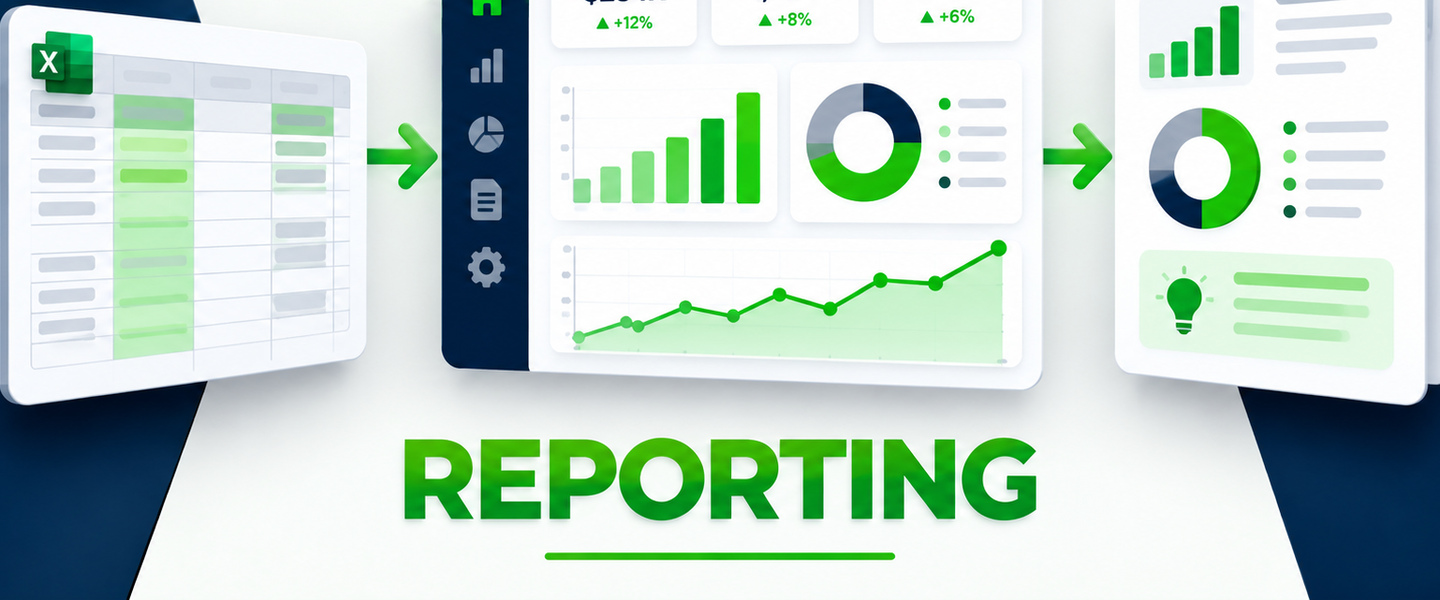
If someone spends hours every week copying files, cleaning columns, combining tabs, updating formulas, and rebuilding the same charts, that preparation may be a strong candidate for automation. The goal is to spend less time assembling the report and more time understanding it.
Design for action
Highlight exceptions and trends that require attention. Use consistent definitions, clear labels, sensible comparisons, and enough context to understand whether a number is good, bad, or simply different. Reporting should reduce questions, not create more of them.
Before worrying about charts, look at where the information comes from, who owns it, how consistently it is entered, and what leadership actually needs to know. Sometimes the biggest reporting improvement is fixing the process feeding the dashboard.